 Custom Product Builder
  Custom Boxes
  Custom Stickers
  Custom Labels
  Custom Postcards
  Promotional Items
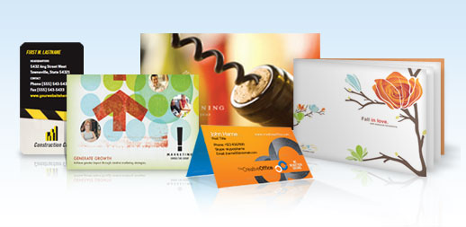
 4 Layout Design Tips for Effective Postcards
1. Play to Viewer Psychology by Keeping it Simple
The human eye can only keep track of so much information at once. This means even though you would love to put all your contact info on an event poster or flyer, hold off. Stick to essential details, like time, date and location. The contact information should be enough to help people get in touch with you, and it shouldn't dominate the page.
Remember, you want to attract attention, but you also want to make it easy for people to understand what they are seeing. Most people only see your print materials at a glance, so don't overload them. Plan your composition with a rough sketch beforehand and try to imagine how much you would be able to absorb in 2-3 seconds or so. That's about as long as you'll have people's attention.
2. Keep Text Clean
Many inexperienced designers have a hard time picking effective text styles. Fancy fonts may be popular, but many times, they are unreadable. Err on the side of sans serif fonts that are clean and clear so people can understand them, and never slap text down on top of colorful images without using a faint outline or something to set it apart.
If you're not sure about whether your favorite font is clear enough, open up a word processor, type in your text, and make the font size very small. Now take a few steps back from the computer screen. That's how it will look from a distance, so keep the image in mind as you go forward.
3.Layout is King
We mentioned before that you ought to plan your composition beforehand with a rough sketch. After you use your sketch to figure out what to keep and cut, figure out where things should to go within your layout.
Remember that because most Western languages read from left to right, you can easily predict where someone will be looking after reading a line of text. Use this principle to lead the viewer's eye to the next important piece of content. You can also use bright images and backgrounds to highlight the beginning of a sentence or line to great effect.
4. Use High-Quality Images, But Use Them Sparingly
Images are one of the most over utilized print graphic design tools. They are important because they draw people in and generally make things look more interesting. The problem is that many images are so colorful they completely dominate compositions.
Limit your use of images to high-quality pictures - low-resolution images look horrible and grainy after being stretched and printed. If you're new to design, focus on images that have limited color palettes or blank space where text will fit in naturally. Grayscale and tinted images in particular work well as subtle backgrounds that keep things classy.
5. Tie it All Together
Finally, remember no banner, flyer, or mailer is effective if it's a big jumble of text. Although you've taken the time to layout text so the eye naturally flows from one line to another, it's likely ineffective unless there is an overall theme. In short, make sure the content of your images matches the subject of the text!
Data Subject Rights
Privacy Request
You may have certain rights with respect to the personal information we collect and process. These rights vary by state and country and depend on your residency. These rights are not absolute and we reserve all of our rights available to us at law in this regard. Please complete the below form to exercise one of your data subject rights, where applicable. We will process your request within the time provided by applicable law.