33 Checkpoints: quality printing at the speed you need.

All Products
Marketing Materials
Business Essentials
Appointment Cards
Business Cards
Carbonless Forms
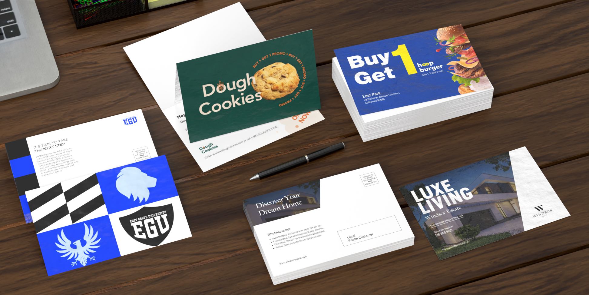
Direct Mail
EDDM
Envelopes
Key Card Holders
Letterhead
Loyalty Cards
Mailing Services
Plastic Business Cards
Round Business Cards
Presentation Folders
Self-Seal Envelopes
Silk Presentation Folders
Square Business Cards
Standard Business Cards
#9 Envelopes
#10 Envelopes
Boxes & Packages
Labels & Stickers
Banners, Posters & Signs
Promotional Items
All Products