Press "Enter" to skip to content
Skip to main content
33 Checkpoints: quality printing at the speed you need.
All Products

10 Common Business Card Design Mistakes You Need to Avoid

Recently updated on January 19th, 2018 at 11:59 pm

“That subtle off white coloring; the tasteful thickness of it… Oh my God, it even has a watermark.”

American Psycho business card scene

I know we’re probably not as obsessive about business cards as Christian Bale’s character Patrick Bateman from American Psycho. I mean, I couldn’t even tell bone color from eggshell. But perhaps, we would benefit more if we were as keen about the subtleties and little details of our business card design.

Business cards have been around for as long as I can remember, functioning as a marketing tool to get people to remember business information. However, advancement in technology as well as a shift in aesthetics, prompted an evolution in the way we design our cards. All too often, people take for granted this factor, and thus, miss an opportunity to give a good impression. A poorly designed card can be damaging, and might even be fatal to businesses, especially if they are just starting up.

Are you committing some of these business card design blunders? Here are ten of the most common business card design mistakes you need to avoid.


Small font size.


Business card with small font size

Most of us, myself included, don’t really have perfect 20/20 vision. We rely on glasses or contacts to correct our vision. Be sure that your font size is readable enough within the business card’s 3.5″ x 2″ size. It’s good practice that you first print out a sample with the actual size of your font. Ask your friends and colleagues if they can read your text legibly. Adjust if necessary.


Poor choice of font.


Comic Sans will probably come to mind for most people when thinking of examples of poor font choices. However, font is actually dependent on the context. For instance, a hospital using Comic Sans would probably raise confused eyebrows, but a day care center using the same font is pretty much okay. Here’s some useful advice. Use only a maximum of two typefaces and run with it. As much as possible, avoid fancy fonts and those that resemble handwriting because they are hard to read in a small area.


Paper shape.


This one is pretty controversial because most people are advocating the use of unique business cards to stand out. In fact, a lot of compilations on the internet that go viral are based around business cards that defy standards and conventions.

For instance, this once-viral video of speaker trainer Joel Bauer talks about how cheap business cards “suck.” According to him, his business card, which is a customized die-cut card, “does not fit in a rolodex because it doesn’t belong in a rolodex.”

Business card with an unusual shape

In practice though, business cards, which are oversized and oddly-shaped, will be hard to put in wallets, purses, and yes, rolodexes. Sure, your recipients may want to show other people your gimmicky card but eventually, they would have to keep it somewhere safe until they need to contact you. In this case, the traditional 3.5″ x 2″ card works. If you want to have a bigger card, consider using a folded one. And finally, if you still want to have a uniquely shaped card, consider using shapes that can fit in your recipient’s wallet.


Paper type.


Your business card is essentially your first impression. You know what they say about first impressions. If your business card is printed on poor quality paper, it will reflect on your business as a whole. We don’t want that.

When printing a set of business cards, ask your printing service provider what your paper choices are. Thicker and higher quality cardstock for business cards usually cost more, but it is definitely a beneficial investment for you.


Color contrast.


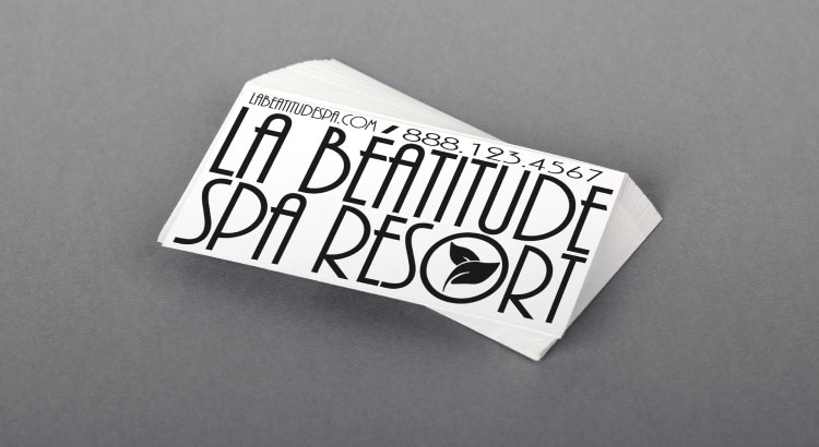
Business card with high contrast.

Here’s another legibility issue, this time with color. If you use a font color that is too close to the color of your background, it might be hard to see for some people. Even more so for people with color blindness. Thus, contrast should be a consideration. As a general rule, try to use a small color palette to base your business card on—something that complements your business colors. Try to use dark colored text on a light background to make it easy to read.


Not giving enough information.


Minimalism seems like the rage these days and for a good reason. You can see in Patrick Bateman’s business card in the video above that serif text on a subtle off-white coloring actually looks elegant and classy. But similar to the previous point, make sure that you still include your essential information in your card. It’s a useless business card if it doesn’t contain any means to contact you, regardless of how good your minimalist design is.


Giving too much information.


It is important to include as much information about your company in your business card. However, your business card is small so your space is limited. If you cram too much in there, you might have to reduce your font size, and thus legibility, or clutter your card, and risk getting a bad layout design.

Business card with too much information.

Consider which information is essential relative to the kind of business you have. Name and position, phone numbers, and email addresses are almost always necessary. Depending on your business, your websites and social media profiles might need to be included. For instance, if you are a graphic designer, you might want to put your Behance profile URL on your card to let your recipient see your portfolio.


Inconsistent branding.


Your business card is an extension of your brand. In business, brand image is important. If your business card’s design, from typefaces to graphics, does not resemble your logo’s aesthetics, it will create confusion on the part of your recipient. As much as possible, try to use the same fonts and color palette as your website and other marketing materials. This way, you will instantly be recognizable.


Lack of white space.


Business card with no white space.

White space is the blank space around your text or graphics. It is also an important element in laying out your business card. Ideally, there should be a balance between your text or graphics (positive space) and the space around it (white space) in order to give focus and emphasis on what you’ve written. It’s okay that you have empty space on your card. Don’t feel pressured to fill your card with other elements or information. After all, one of the business card’s main purposes is ease of access to your contact information. Effective use of white space helps do just that.


No unique selling proposition.


You don’t want your recipient to look at your card after a few days and ask himself “Who is this again?” Sure, you can use a wacky shape or a bright and bold design for your card in order to stand out. But the thing is, you exchanged cards with your potential business partner because of business. What you actually do is what makes you relevant to your recipient, not gimmicky designs. You should put your brand promise—that one unique reason why your recipient should do business with you.


Which business card design mistake are you guilty of? Tell me in the comments section below. Don’t worry. I won’t judge.

Leave a Reply

Your email address will not be published. Required fields are marked *