Press "Enter" to skip to content
Skip to main content
33 Checkpoints: quality printing at the speed you need.
All Products

Art of the Menu – 10 of the Most Inspiring Restaurant Branding Designs

Recently updated on January 19th, 2018 at 11:59 pm

The key to a restaurant’s success is consistency.

For a restaurant to be appealing, both the food and the environment should be in harmony with each other. You must remember that not only are you selling food, you are also selling an experience. From the menus and the tableware, to the seats and walls of your restaurant, everything in your restaurant branding should be consistent thematically to keep your customers coming back for more.

Thus, you should devote a considerable amount of time planning the direction of your brand. The visuals such as the logo, the typeface, and the general design should be your top priority.

For instance, one of the first things a customer would see in a restaurant is the menu. Since it is where the customer looks for what food to order, it is crucial that you put a great deal of effort into deciding the design and layout of your menu. Your choice of seat designs should also be consistent with your theme. Would a minimalist stool fit in a brew pub setting? Should you get the homemade-style table or the elegant, classy one?

In writing, it is easy to say, but the reality is different. It’s a bit easier said than done.

Worry not, I got you covered. I’ve compiled some of the most outstanding restaurant branding and designs you will ever see. The designs featured in this post are truly inspiring and artistic and were all created as part of larger branding campaigns. These designs reflect an aesthetic that is mirrored in the furniture, décor, business cards, letterhead, cutlery, etc. They represent businesses who really know how to present a united and beautiful image to attract customers.

If you are thinking about rebranding or are in the process of creating your own bar or restaurant empire, then look no further. Here are 10 incredible examples of restaurant branding for your inspiration:

1. Noroshi

c7799f33555875.56d977dfe7af0  e8afb133555875.56decd79b10f1  e7f0c333555875.56d0932162057

Noroshi is not your typical Japanese restaurant. The feel of the design evokes the woodcut paintings of the ancient Japanese. Even the minimalist feel of their menu layout is in line with the simplicity of Japanese aesthetics. What caught my attention, however, is their clever use of their restaurant name. The Japanese characters のろし(Noroshi) mean smoke signals, which they used to create the smoke emanating from a ramen bowl.


2. Willi’s Seafood & Raw Bar


db58c536142201.57108e3ba4555 c9ee9836142201.57108e3ba3740 0a3f7836142201.57108e3ba206d

Willi’s Sea­food & Raw Bar is a seafood restaurant in downtown Healdsburg, where the East Coast and South America meet Wine Country. This branding, created by Josip Kelava, is actually a rebrand to give the restaurant an updated fresh look. The predominantly blue color scheme indeed creates a “food straight from the sea” feel, as expected from a seafood bar.

Elements from their old logo were incorporated into the new one and expanded further into the menu design, tableware, and uniforms. By doing this, they did not alienate their current patrons who liked the old design. At the same time, they also made it accessible to newer customers who prefer modern aesthetics.

3. The Shack

f5621733951248.56bdf41852508

fa178933951248.56bdf41940194  7cfe9933951248.56be02b17dbed

The Shack is another seafood restaurant conceptualized by Backbone Branding. While it has quite a straightforward name, The Shack puts the whole seafood eating experience into an image of a small seaside fishing house.

The resourceful concept makes do with limited design opportunities, using things that can usually be found in fishing houses. Even the aprons are made from sacks to put sea products in. The main colors, blue and red, were chosen as the main brand colors indicating deep sea and cooked seafood.

4. Platz Bad Reichenhall

16e68533828256.56b9e6e6237f1 00e02833828256.56b9df41ce847 428f0333828256.56b9df41d6437

This concept for the Platz Bad Reichenhall is based on the original Platz restaurant in Budapest, which had a bit of the “Kaiser’s touch.” The first thing I noticed about the overall concept is the sleek and clean look. The font choice looks very formal and classy, fitting for the type of restaurant it wants to portray. The walls are adorned with portraits of personalities that helped shape the Hungarian culture. Suffice it to say, the concept of this branding is a celebration of Hungarian culture.


5. La Fábrica del Taco

74193c17387079.562e4a31aac2e 86193a17387079.562b967a9db64 b6da7f17387079.562f3affa6699

I’m probably not the only one who immediately thinks of luchador (wrestler) when I hear the word Mexico so I’m quite intrigued by the design for Mexican restaurant La Fábrica del Taco. The concept, created by Hola Bosque, is as explosive as a luchador’s flying press. The interior of the restaurant is an explosion of color, very characteristic of Mexican cuisine. Familiar ingredients such as habanero and guacamole decorate the restaurant menus. The neon colors are also a nice touch to make the menu stand out to the reader.


6. Jalapeños

c3aac129624115.55fba19596b18

Another Mexican themed restaurant, which this time focuses on the jalapeño. The design of the mascot has character and is consistent with the feel of their restaurant. The best thing the designers conceptualized in branding it is the direction of their social media, using images from their existing restaurant design.

7. Flamingo

4ffaf924373203.56333161cc9a3 7a7c6424373203.5633654872d76 c0c14e24373203.5633315c05046


Here’s an example of one central idea that resonates throughout every aspect of the restaurant’s branding. The design team of Flamingo Restaurant and Bistro took an image of a flamingo as it stands in the water lifting one foot up in the air and used it to create a standout logo and motif. Even the ornaments used in the restaurant—the thin metals that hold the lights, and the feet of tables and chairs—evoke the slender legs of the flamingo.

8. Arzábal Food Truck

5e130133749326.56b655c4bbbd6 8eb4b533749326.56b655c4b92d7 64f58233749326.56b655c4ba813


The on-the-go nature of food trucks should not distract you from creating a compelling design.  Arzábal Food Truck’s designers opted for a minimalist and modern feel to their food packaging. The use of yellow and violet is a bold move, and makes it stand out from the usual red and orange colors. This design is also reflected in their website.


9. Dinette

5fd0b232780135.5693c683a23c1 b4361132780135.5693c6839ec8c c4841932780135.5693c683a11d5

Using the tagline “Cucina di ringhiera” which refers to Milanese apartments connected by a banister, the designers of Dinette created a set of hand-drawn icons representing the world of banisters. Their color scheme of bluish gray is accented by their use of a flower motif with subdued colors. Old wooden tables and utensils kept inside a tin can adds a homey, countryside feel.


10. Edmund’s Oast

d097aa33874202.56bb5024b4f5d 9f43ef33874202.56bb5024b364a d5761433874202.56bb5024b6713

Named after Edmund Egan, a famed English brewer and oast, the kiln used in the drying of hops to make ale, Edmund’s Oast is one of those pubs that value tradition. The design sticks to the roots of ale and uses practical ornaments to decorate the walls and floors. The wood design for their beer mats and menus and the planks that adorn their walls provide a rustic English town feel to it.


Did these creative restaurant branding designs inspire you? Do you have a rebranding story to tell? Talk to us in the comments section below!

One thought on “Art of the Menu – 10 of the Most Inspiring Restaurant Branding Designs

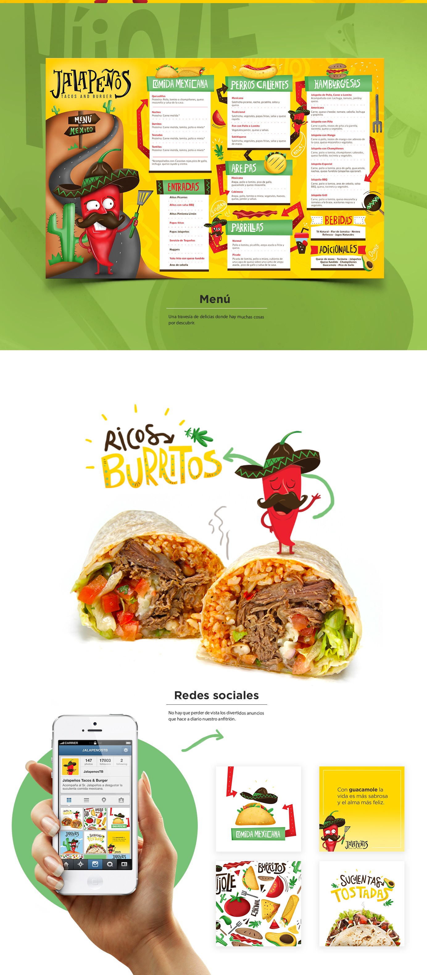
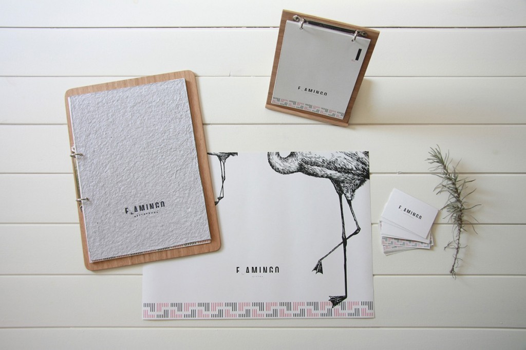
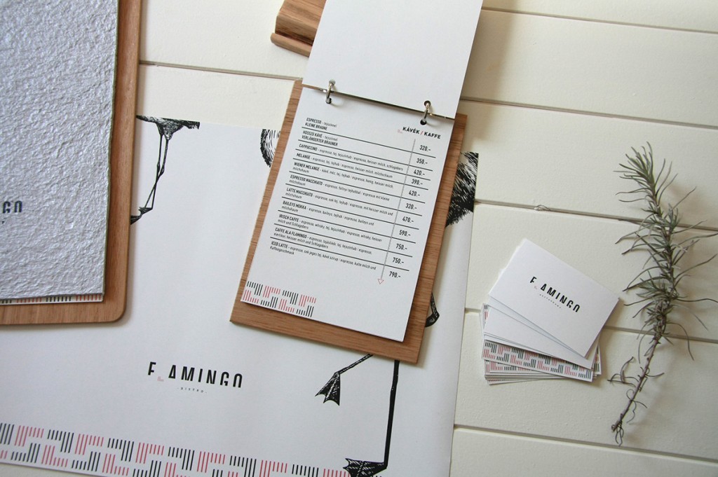
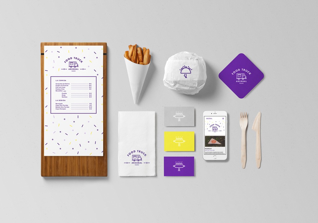
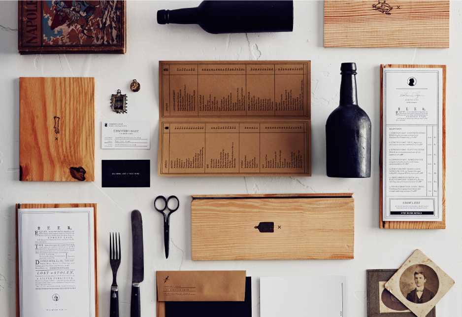
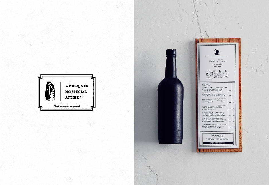
  1. Great selection! I really enjoyed going through the different brands, some of them are more structured than others but very sophisticated and quality design driven. very nice job.

Leave a Reply

Your email address will not be published. Required fields are marked *