33 Checkpoints: quality printing at the speed you need.

All Products
Marketing Materials
Business Essentials
Appointment Cards
Business Cards
Carbonless Forms
Direct Mail
EDDM
Envelopes
Key Card Holders
Letterhead
Loyalty Cards
Mailing Services
Plastic Business Cards
Round Business Cards
Presentation Folders
Self-Seal Envelopes
Silk Presentation Folders
Square Business Cards
Standard Business Cards
#9 Envelopes
#10 Envelopes
Boxes & Packages
Labels & Stickers
Banners, Posters & Signs
Promotional Items
All Products
Brochures
Business Flyers
Calendars
Club Flyers
Comp Cards
Custom Flyers
Die Cuts
Dine-in Menus
Door Hangers
Event Flyers
Folded Cards
Greeting Cards
Mail Flyers
Postcards
Flyers
Invitations
Menus
Rack Cards
Sell Sheets
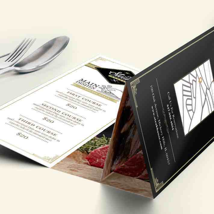
Table Tents
Take Out Menus
Appointment Cards
Business Cards
Carbonless Forms
Direct Mail
EDDM
Envelopes
Key Card Holders
Letterhead
Loyalty Cards
Mailing Services
Plastic Business Cards
Round Business Cards
Presentation Folders
Self-Seal Envelopes
Silk Presentation Folders
Square Business Cards
Standard Business Cards
#9 Envelopes
#10 Envelopes
Custom Boxes
Custom Pouches
Hang Tags
Header Cards
Mailer Boxes
Product Boxes
Shipping Boxes
Silk Hang Tags
Spot UV Hang Tags
All Packaging
Bulk Stickers
Bumper Stickers
Custom Labels
Custom Stickers
DTF Transfers
Hand Sanitizer Labels
Jar Labels
Product Labels
Reflective Stickers
Roll Stickers
Sticker Sheets
Water Bottle Labels
Wine Labels
All Labels
All Stickers
A-Frame Signs
Aluminum Signs
Backdrops
Banners
Canvas Prints
Deluxe Retractable Banners
Feather Flags
Mounted Posters
Pole Banners
Posters
Retractable Banners
Rolled Canvas
Stretched Canvas
Teardrop Flags
Vinyl Banners
Wall Decals
Window Clings
Window Decals
Yard Signs
All Banners
Marketing Materials
Booklets
Brochures
Business Flyers
Calendars
Catalogs
Club Flyers
Comp Cards
Custom Flyers
Die Cut Printing
Direct Mail
Door Hangers
Every Door Direct Mail
Event Flyers
Flyers
Folded Cards
Greeting Cards
Invitations
Magnets
Mailing Flyers
Menus
Postcards
Rack Cards
Roll Stickers
Sell Sheets
Sticker Sheets
Table Tents
Take Out Menus
Vinyl Banners
Business Essentials
Appointment Cards
Business Cards
Business Flyers
Carbonless Forms
Catalogs
Direct Mail
Every Door Direct Mail
Envelopes
Flyers
Key Card Holders
Letterhead
Loyalty Cards
Mailing Flyers
Mailing Services
Plastic Business Cards
Postcards
Presentation Folders
Rack Cards
Round Business Cards
Self-Seal Envelopes
Sell Sheets
Silk Presentation Folders
Square Business Cards
Standard Business Cards
Roll Stickers
Sticker Sheets
Custom Boxes
Packaging Tape
Company Apparel
Boxes & Packaging
Labels & Stickers
Custom Stickers
Roll Stickers
Sticker Sheets
Bumper Stickers
Clear Stickers
Vinyl Stickers
Metallic Stickers
Oval Stickers
Rectangle Stickers
Round Stickers
Square Stickers
Die-Cut Stickers
Custom Labels
Product Labels
Food Labels
Water Bottle Labels
Wine Labels
Beer Labels
Jar Labels
Hand Sanitizer Labels
Hand Sanitizer Stickers
DTF Transfers
Return Address Labels
Reflective Stickers
Label Sets
All Labels
All Stickers
Banners & Signs
A-Frame Signs
Aluminum Signs
Backdrops
Banners
Canvas Prints
Car Magnets
Deluxe Retractable Banners
Fabric Banners
Feather Flags
Mesh Banners
Mounted Posters
Pole Banners
Posters
Retractable Banners
Rolled Canvas
Stretched Canvas
Teardrop Flags
Vinyl Banners
Wall Decals
Window Clings
Window Decals
X-Banners
Yard Signs
All Banners
All Signs
Promotional Items
Apparel
Auto & Safety
Bags
Business Card Magnets
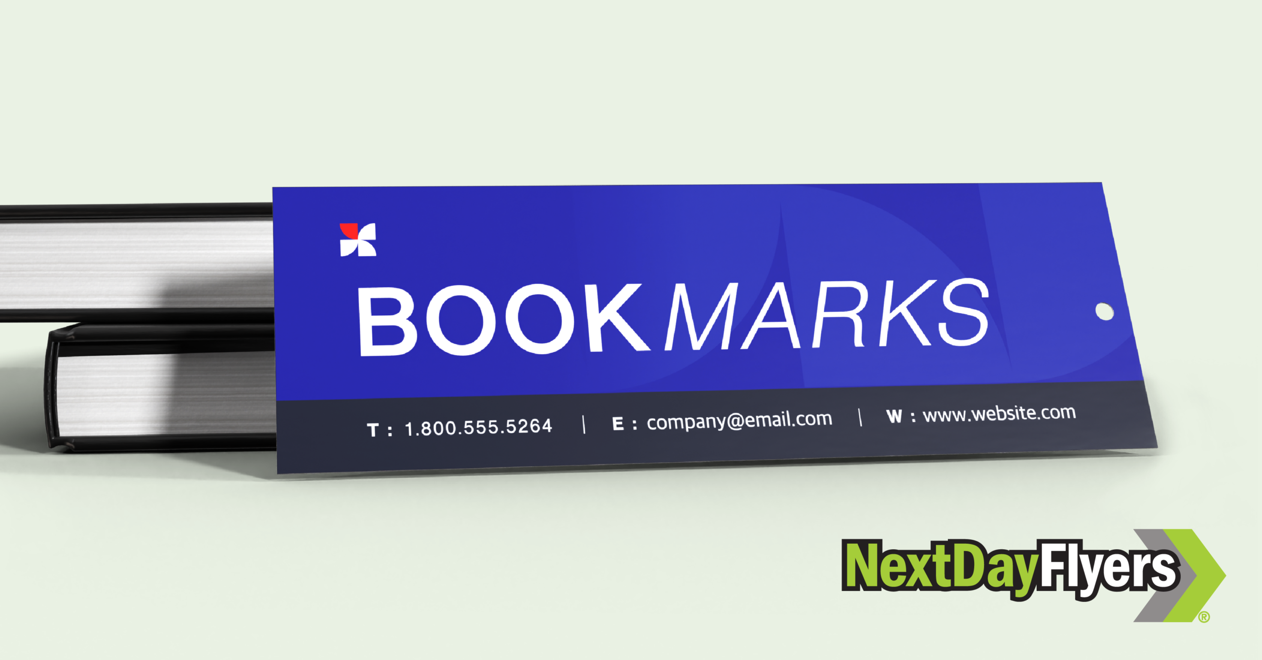
Bookmarks
CD/DVD Insert Printing
CD Products
DVD Products
Drinkware
Gift Certificates
Magnets
Health & Wellness
Magnetic Calendars
Metallic Save-the-Date Cards
Notepads
Office & Stationery
Outdoor & Leisure
Patches
Pens
Table Cloths
Technology
Tickets
Wall Calendars
Services & Support