Press "Enter" to skip to content
Skip to main content
33 Checkpoints: quality printing at the speed you need.
All Products
Catalogs and Booklets
All Products

5 Big Business Card Mistakes You Can Fix Today

Designing a business card is easy, right? Well, if you want to establish more connections and create a stronger first impression, your business card must be more than just neat.

Aside from complete and accurate information, your design must also be clear, organized, and print-ready. Small errors or design issues can sometimes lead to delays or revisions during printing.

To make things easier and help you put your best foot forward, we’ve put together a few helpful tips, starting from the five common business card design mistakes to watch out for before submitting your final design.

Mistake #1: Using Low-Resolution and Pixelated Images

Low-quality and pixelated images are red flags when designing your card’s visuals. Grabbing smaller images and enlarging them won’t cut it either. You need high-quality images from the get-go, and they should fit well with the 3.5″ x 2″ standard business card size.

What to do instead:

  • Design at 300 dpi minimum.
  • Pick high-resolution photos, logos, and icons
  • Avoid enlarging small web images
  • Work from a print-ready template
  • Set your file to CMYK, not RGB

Mistake #2: Using Poorly Taken Photos

Image-size aside, you should also choose the best pictures that will represent your brand in the best way possible. Professionals may put their portrait photos to make their business cards more personalized. If you want to do the same thing, the photos you submit must be high-quality, professional, and recent.

Good Photo Ideas Avoid These Photos
• Professional headshots (ID or passport size)
• Work-appropriate attire (uniforms, suits, etc.)
• Neutral background colors
• Simple but high-quality resolution (300 dpi)
• Selfies or cropped photos
• Photos unrelated to your work
• Heavy filters or excessive modifications
• Casually snapped or personal images

Mistake #3: Loading Your Business Card With Too Much Information

The simplest design is often the best when it comes to these cards. Avoid overloading your business card with unnecessary information that makes your business card look cluttered and difficult to understand.

Always focus on these essentials:

  • Your complete name
  • Your position in the company
  • The company name (including the address)
  • Relevant contact information (email, phone number, website)

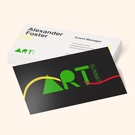
If you want to add more details, ensure that these fit with your 3.5″ x 2″ standard layout, don’t conflict with your images, and blend well with your design template. Keeping your words to a minimum and sticking to the important texts may also help you avoid the following mistake.

Mistake #4: Typos, Spelling, and Incorrect Information

The problem with too much text is that there can also be too many typographical errors and grammar mistakes. Misspelled names, wrong digits in phone numbers, and broken URLs are also common, even if your layout is accurate and the design is organized.

Fixing these errors just before printing can be both costly and time-consuming, so ensure you do these things before you send your design to the printers:

  • Proofread your card several times.
  • Double-check the accuracy of phone numbers, emails, and URLs.
  • Ensure that all contact information is updated and active.
  • Have someone else review the business card template.
  • Make sure spacing, capitalization, and punctuation are correct

Mistake #5: Using the Wrong Design Software

Use proper design tools like Adobe Illustrator, Adobe InDesign, or Adobe Photoshop so image quality and layouts remain consistent.

You may also use online card design tools made for printing, including NextDayFlyers’ very own design tool and free templates.

If you are not confident with your online arts, you can always hire a professional designer. Most online printing groups like NextDayFlyers have an in-house graphics team that will get the job done. Simply specify what you want your design to look like, and they can send you design proof that you can accept or modify until you are satisfied.

Final Thoughts

A good rule of thumb whenever you are starting to design a business card: If it doesn’t look good on the screen, it will look worse on the print. So, the best advice for anyone wanting to distribute high-quality cards during events and meetings is to put more effort into designing a simple but professional business card that both clients and other recipients would love to receive.

NextDayFlyers can help bring your creative and personalized business cards to life, but the creative and personalized design should first come from you.