Recently updated on September 30th, 2017 at 12:26 am
Classic Colors
Color plays a huge part in giving a design a certain feel. For example the color green is heavily associated with nature and being eco-friendly. So, when trying to associate a product or service with either, designers use the color green in various ways.
There are certain colors and color palettes that are also associated with being classy, elegant and/or regal. You can use these colors to help make your business cards look more elegant. Certain things you could change are your logo colors, the background color of the business cards, design elements, photographs and so on. When combined with the other elements below, your business cards will help you project the exact image you want to your customers.
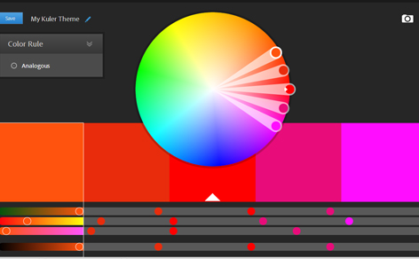
The website kuler.adobe.com has great color palettes created by designers and can help you find some elegant and classy colors for your business cards.
The Kuler site is a myriad of colorful ideas
Traditional Fonts
Typography is extremely important when it comes to achieving an elegant appearance. Using the wrong font can totally throw off the image you are trying to achieve. Since business cards are so small in size, its important to keep the number of fonts you use to a minimum. 1-2 fonts with a maxim of 3 is a good rule of thumb. Its common to have a display font for larger text such as titles and then a text font for smaller copy such as your contact information or list of services.
Here are some good examples of classic/elegant serif style fonts you can use in your business card designs. UrbanFonts is another place to find lots of great classic fonts for your business cards.
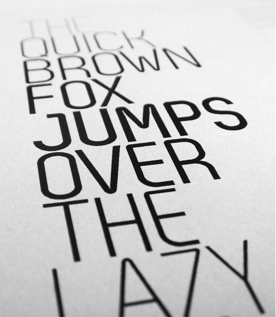
Click on the “novello” image above for some super-elegant fonts
You need to use beautiful fonts for a stylish finish
Top-Quality Stock Photos
If you are going to use images in your business card designs, its critical that you use only top-quality stock photography from expert photographers. Its also essential that you use photographs that project a feeling of elegance and class if that’s what you want for your business cards. Do you research and make sure the images you pick relate properly to your business or product. Try asking friends and family which photos they like best and what kind of feeling or message they get from the photos when combined with your other business card design elements.
The stock photo site iStockPhoto.com has a large selection of photographs to choose from at affordable prices. They also have vector images, patterns, background graphics and more so there is something for everyone.
Try iStock, Fotalia, Getty Images, and many more image sites for inspiration
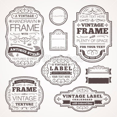
Tasteful Design Elements
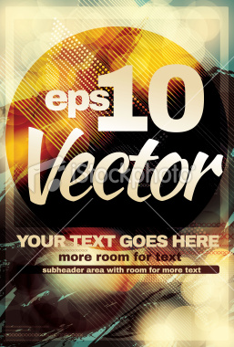
Design elements are a great way to add some flair to your card designs. Floral design elements, clean lines, elegant shapes and so on can do a great job at enhancing the elegance of your business cards or other design projects. Small design elements are often used to break up text, or highlight certain information. These elements can also become symbols in your logo design. Below are some samples of beautiful classic design elements from iStockPhoto.com
Make use of all the Vector files and PSD files that are available to you online
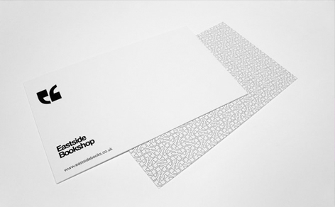
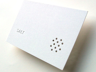
Keep it Clean and Simple
The easiest way to give your cards an elegant feel is to keep the design simple and clean. Use a minimal amount of text, design elements, colors and other graphics. Let the beauty of the colors, typography and images you do use shine by not crowding them too much.
White space (negative space) is an important part of creating great designs. It is simply the process of giving all your design elements enough padding around them so that your eyes do not feel crowded. It help viewers read better and white space can actually help draw attention to elements, just by being empty space. Be sure to spend plenty of time with the positioning of all your design elements and copy to achieve the right amount of white space.
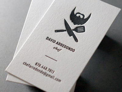
a superb example of business card simplicity and elegance
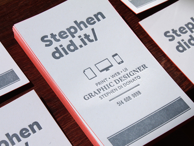
10 Examples of Elegant Business Cards
Below are some more great examples of elegant looking business card designs for some creative inspiration. Be sure to print your business cards with NextDayFlyers.com so that they print perfect and ship-out on time.