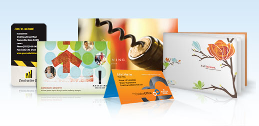
How to Design Business Cards: 4 Mistakes to Avoid


Designing your own business card? Great—until a few missteps make it look amateur. Whether you're launching your first business or refreshing your personal brand, a well-designed card still matters in 2025. Let's make sure yours stands out for the right reasons. Below are four of the most common design mistakes and how you can avoid them.
1) Mixing Too Many Fonts
Keep it simple and clean.
- Stick to just two fonts: one serif (like Garamond) and one sans serif (like Helvetica).
- Avoid stacking bold, italic, script, or novelty fonts in a single layout.
- Prioritize clarity over creativity—your card should be easy to read at a glance.
2) Overloading the Card With Content
Let your design breathe.
- Don’t cram every detail on the front. Focus on the essentials: name, title, phone, email, and website.
- Use white space to your advantage—it helps guide the eye and keeps things polished.
- Need more room? Use the back of the card for secondary info, social media handles, or a QR code.
3) Using Low-Quality Images or Distracting Backgrounds
Make sure your visuals support your message.
- All images should be 300 dpi to ensure clean, professional print quality.
- Avoid using detailed background images that interfere with text readability.
- If you do use a photo or texture, reduce opacity or contrast so it complements the content.
4) Relying on DIY Printing Kits
Invest in professional quality.
- DIY kits often result in cards with dull ink and rough, perforated edges.
- You may save a few dollars upfront—but you'll pay in lost first impressions.
- With NextDayFlyers, you get crisp, high-resolution printing on premium stock—with rush turnaround if needed.
Final Thoughts
A great business card should work just as hard as you do. Avoid the common pitfalls, focus on what really matters, and trust NextDayFlyers to bring your design to life. With fast printing, professional finishes, and expert support, you can create business cards that truly represent your brand.