Top 10 Mistakes to Avoid When Designing and Printing Brochures


Brand promotions come in different shapes and forms, but if you want a tried and tested way to market your business with comprehensive information and tactile appeal, brochures are the way to go. These informative pamphlets combine sleek design with detailed content, testimonials, and contact info in a compact, foldable format.
Still, even the best ideas put on paper can fall short if you overlook key design or printing details. From cluttered layouts to poor paper choices, common brochure mistakes can ruin your message before it’s even read. In this guide, we’ll walk you through 10 of the most frequent brochure design and printing errors and give you practical tips to help you avoid them.
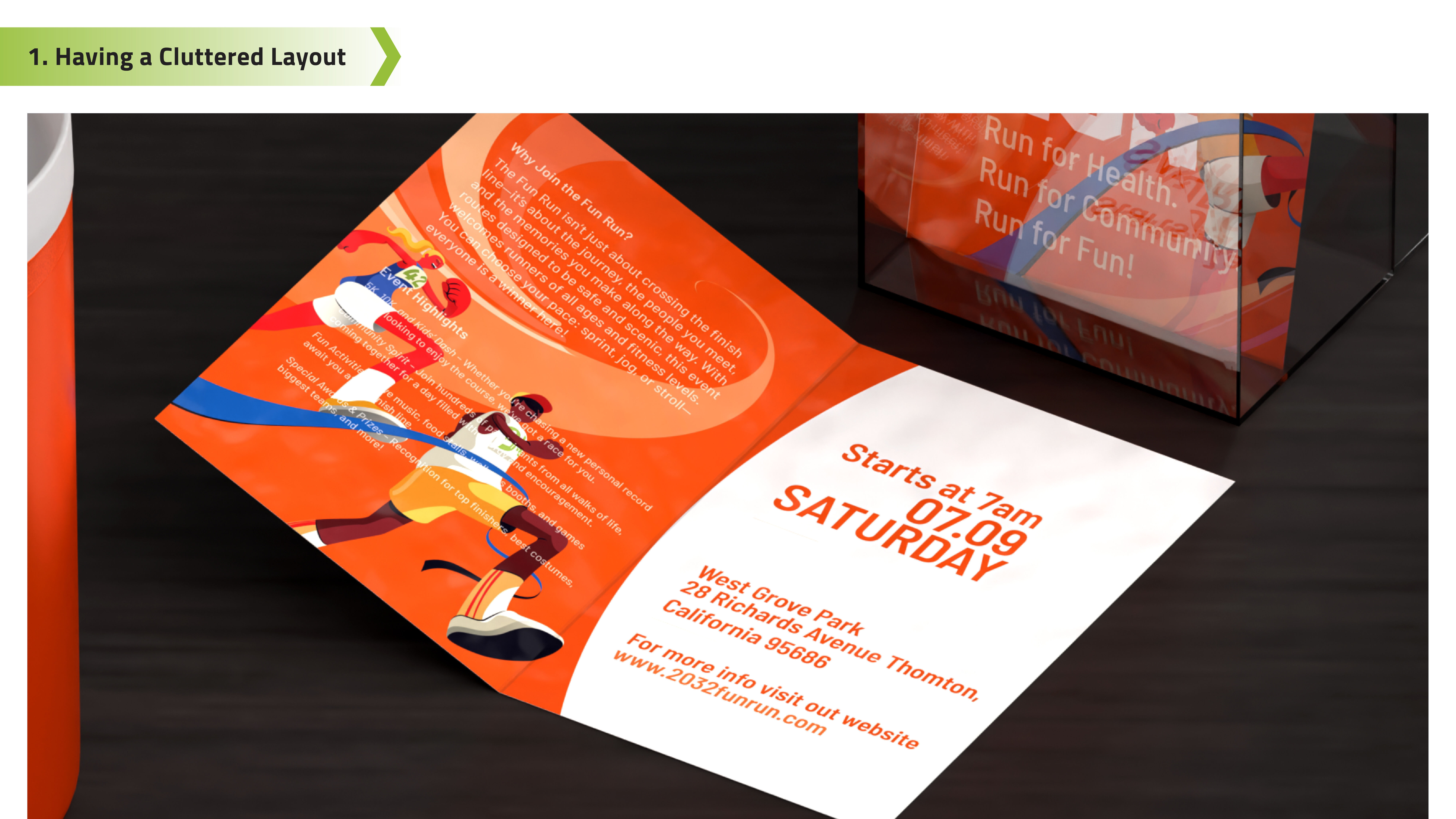
1. Having a Cluttered Layout
- Brochures are meant to look clean, organized, and visually appealing. A messy and disorganized layout can discourage your potential customers from reading more.
- Cluttered brochure designs will make it hard for readers to follow your message and can completely derail the purpose of the brochure.
- Choose the right brochure size and folding style to help balance your content. Use a clear layout that separates text and images and avoid putting too many ideas in one section to keep the design readable.

2. Using Low-Quality Images
- Most marketing materials create a first impression for customers, whether positive or negative. Expect the latter if you're using low-resolution or pixelated images for your brochures.
- Blurry or poor-quality photos make your brochure look unprofessional and can turn readers away before they even read the content.
- Always use high-resolution images suitable for printing, ideally 300dpi or more. Also, check the file types and ensure your images won’t lose sharpness when resized or printed.

3. Overcrowded Text and Long Paragraphs
- Brochures require a perfect balance of text and design. Long paragraphs and large chunks of text break that important rule.
- Dense paragraphs will overwhelm readers and make your brochure feel more like a textbook. It also causes important messages to get lost and buried under long paragraphs.
- Write in short, clear sentences and break up content into digestible chunks. Use bullet points, subheadings, and white space to improve flow and make it easier for readers to scan and absorb your message.

4. Inconsistent or Outdated Branding Information
- Offering outdated details, old branding, or incorrect contact info on brochures is a mistake that can damage your brand's credibility and trust.
- Brochures that include the wrong phone number, address, or brand will confuse your customers and may lead to missed sales and referrals.
- Always double-check that your contact details, business hours, offers, and other brand information are current and consistent with your website and other materials. Keep your brochures updated regularly so customers always receive accurate information about your brand.

5. Typographical and Grammar Errors
- Even one typo or grammar mistake in your brochure can leave a poor impression on readers, leading them to question your professionalism.
- Multiple errors can also make your business appear careless or unprofessional. These errors will also reduce customer confidence and make your brand harder to trust.
- Proofread your content multiple times and have someone else review it with fresh eyes. Watch out for spelling, punctuation, and formatting issues. Also, make sure details like email addresses, phone numbers, and website URLs are typed correctly.
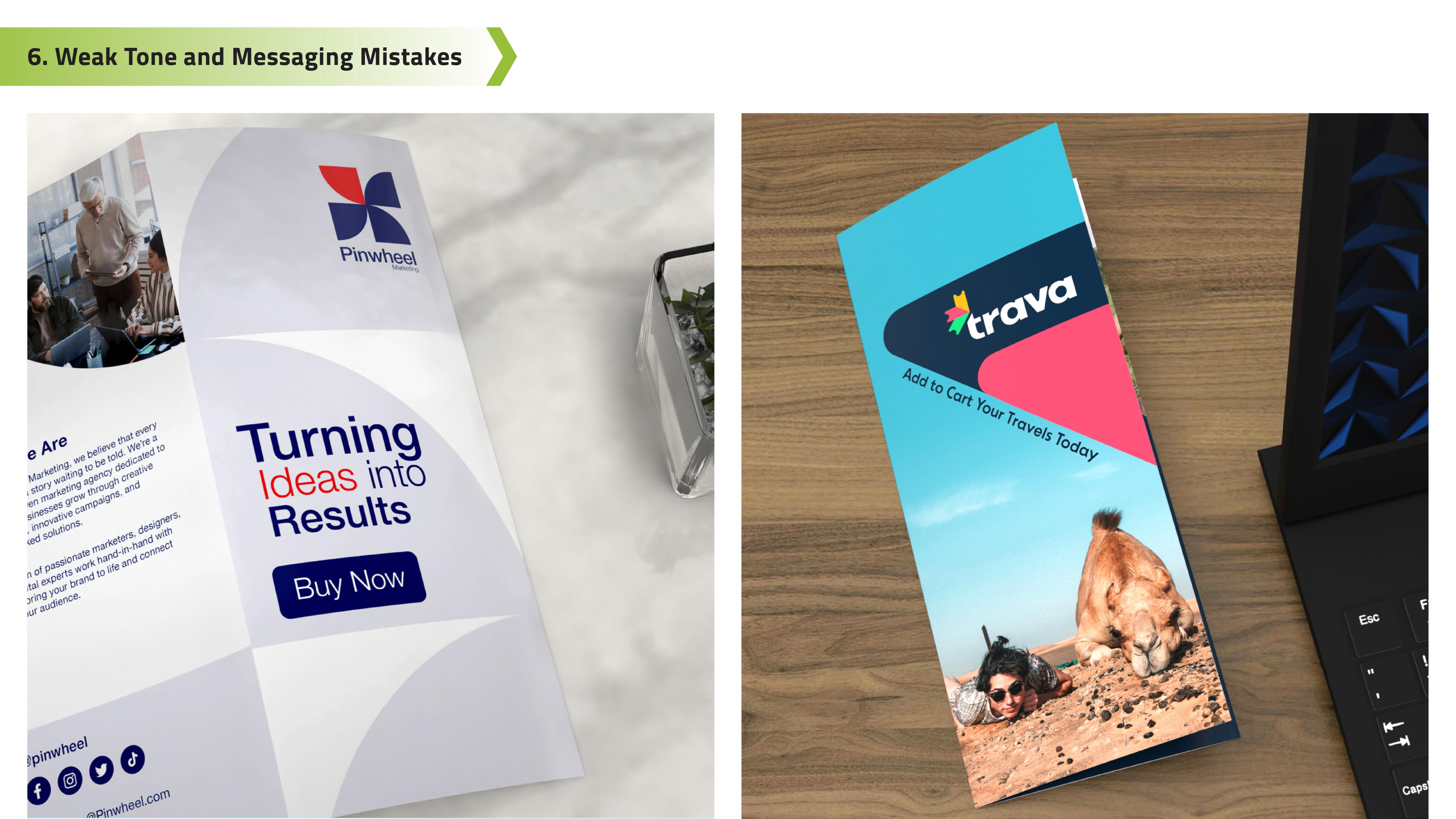
6. Weak Tone and Messaging Mistakes
- Putting a strong voice or a specific purpose in your brochure will help promote your brand and clearly define it according to your vision-mission statement. A brochure with bland or unclear messaging, even if accurate, will fail to connect with readers.
- Weak messaging comes across as generic or forgettable, and customers will second-guess supporting your brand. In some cases, customers may also find the tones conflicting if your message doesn’t fit with your design layout.
- Craft strong headlines that grab attention and match your brand's personality. Define your branding and goals clearly, whether it's to promote a service, announce a sale, or introduce a new product. Also, don't forget to add a clear and powerful call to action that will guide your readers.
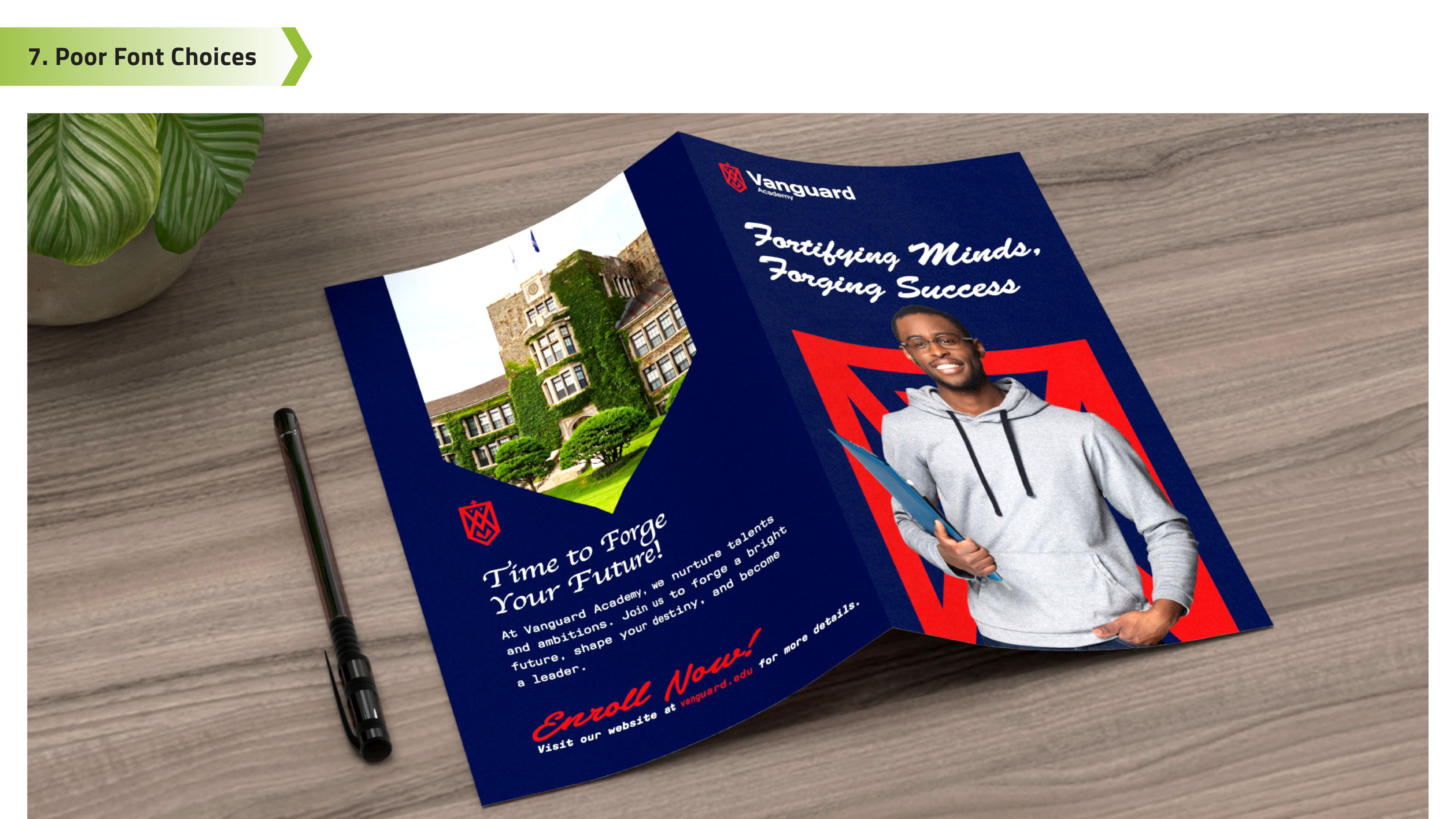
7. Poor Font Choices and Inconsistent Styles
- Using hard-to-read fonts or mismatched styles in your brochure can lead to confusion and weaken your message.
- Fonts that are too fancy, small, or inconsistent can make your content hard to read. Some fonts may also make your brand look unprofessional.
- Stick to clean, simple fonts like sans serif styles, and limit yourself to one or two font faces. Keep headers, body text, and calls-to-action consistent in size and style, so your brochure flows naturally and is easy to read.
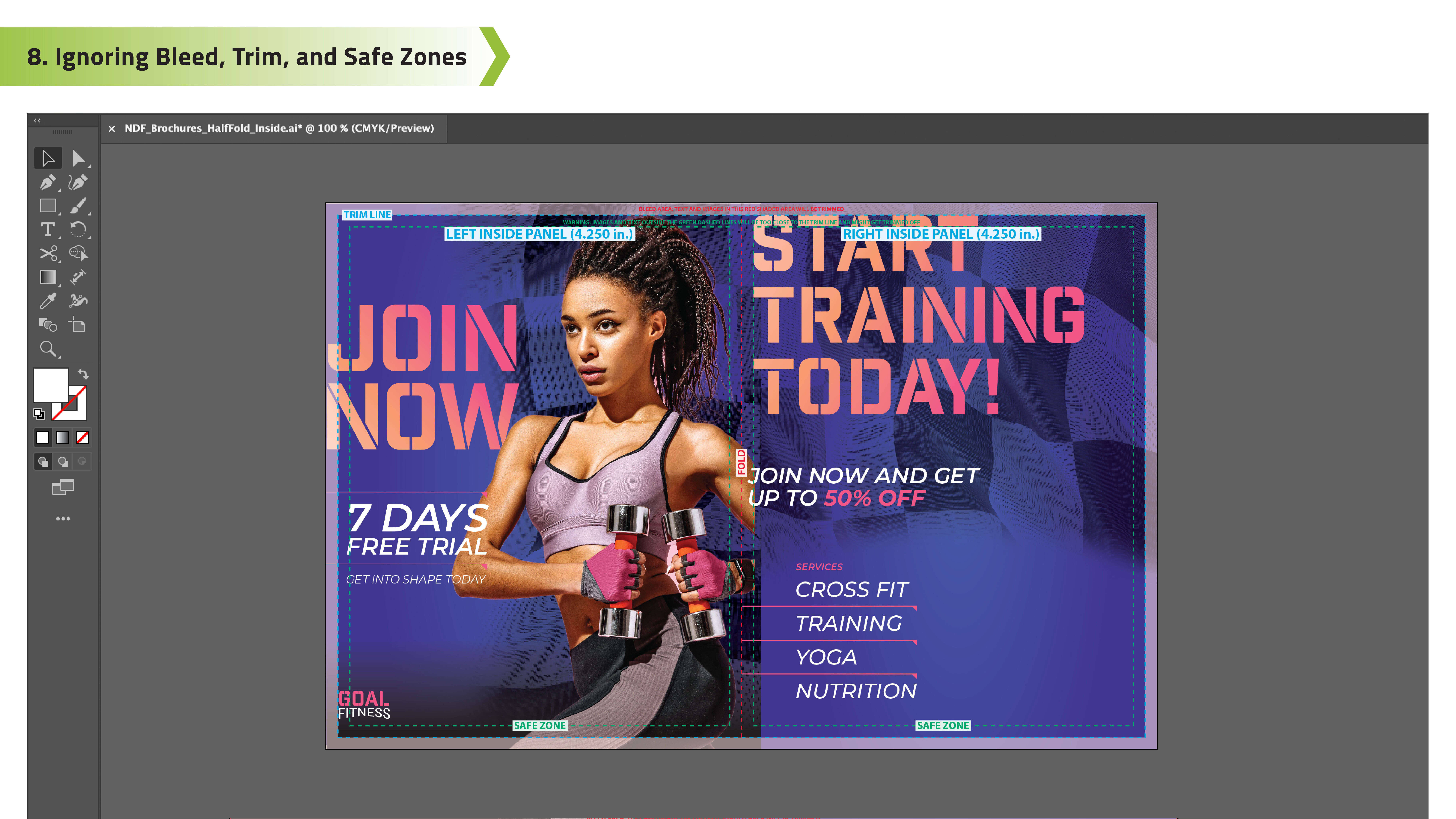
8. Ignoring Bleed, Trim, and Safe Zones
- Overlooking print guidelines like bleed, trim, and safe zones can ruin your brochure's layout during the final printing and cutting process.
- Placing important content too close to the edges will end up with the text getting trimmed off. Some designs that don't follow lines may also result in unbalanced brochure printing.
- Always follow proper print layout rules, especially if you are submitting your design to professional printers. Extend the background colors or designs into the bleed area and keep important content within the safe zone. Also, leave space around the edges to ensure your brochure prints exactly as planned.

9. Wrong File Formats and Color Modes
- A great brochure design can still make errors if the file is saved in the wrong format or color setting for printing.
- Incorrect formats may lead to color shifts, low image quality, or layout problems once printed.
- Before sending your file to print, make sure you're using the right format. Most printers use PDF, but PSD, Adobe AI, and other files with 300dpi may also work. Always design in CMYK color mode and use high-resolution images (PNG or JPEG) to ensure your brochure looks sharp and accurate.

10. Choosing the Wrong Paper Material
- Your brochure's final look and feel depend heavily on the paper type and cardstock. Picking the wrong material will affect the overall design and presentation of your brochure.
- Using flimsy paper, the wrong finish, or incompatible fold styles can make your brochure look cheap or hard to handle.
- Choose a paper stock that fits your purpose. Consider weight, coating, and folding compatibility to match your design, branding, and intended use for the brochure.
A well-made brochure should guide readers about your brand's history and message while communicating all the services and products you offer. When done right, customers will have a complete understanding of your brand, and they will trust everything that you offer. Get the brochure's design and information right and print them on trusted cardstock so you have a complete pamphlet to give to people to remember you by. And when you're ready to print your batch of brochures, let NextDayFlyers help bring your design to life with professional results.