In this post I will attempt to look at the specifics of poster design and try to explain how certain design techniques, color choices, fonts, and design structure can be used to make a superb promotion. The following posters are a myriad of different design styles and executions but represent the highest quality of design work for churches and religious groups.
Original source: http://www.behance.net/gallery/Go-to-Africa/822475
Layout and Structure
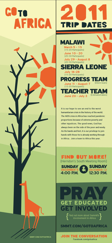
This beautifully simple and elegant design by graphic designer, Eric Wierenga, is a wonderful example of how you should treat a design that houses a lot of information. This informational poster could’ve been very cluttered and difficult to read. Instead, Eric has used very wise layout choices to break the complex design elements down into distinct segments that the viewer can easily follow with their eye.
The design is no doubt helped by the unconventional poster size; the elongated portrait size makes this poster very different and interesting. However, the greatest achievement of this poster is in the layout.
Here’s how he optimized his layout to include all the image and text elements:
Two distinct sections – one to present the headline and graphic, and an info section to display all the necessary dates and meeting information.
The info section is further broken into “bite-sized” pieces of dates, times, body text, and call-to-actions
The bold color blocking and text combinations ensure that each piece of the puzzle is appealing but easy-to-follow – the deeply contrasting color sections and text are key to the design being so effortless
Before Erik started this project, I’m certain that he meticulously planned this design out before creating it. My advise to anybody who is about to create their own church poster design, is to pre-plan with thumbnail sketches. Whether you’re using digital or traditional design methods to create your poster artwork, the succes of a poster depends on the planning.
Poster planning with Thumbnail Sketches
Here is a poster design that I did for local community and church groups in Bristol in the UK. Its intent was to promote an art festival in the local park that was trying to get kids in a low-income area of England to develop an interest in art and their community. Although this was a digital design that I created with Illustrator and Photoshop, There was a great deal of planning that went into the project. As a successful designer, I never start any design project off without planning the layout and structure.
Here are some of the corresponding thumbnails that I created very quickly with a pad and pen to give myself an Idea of where the text and image elements would be placed. I had a stock image of the boy as a start off point but needed to plan the rest of the design elements to accompany this image. The thumbnail sketches enabled me to plan and prepare my design composition.
Pre-planning is so important when it comes to creating a successful poster design.
Original source: http://www.behance.net/gallery/The-Veritas-Forum-12/3137161
Font and Color Choices
Your font and color choices can make or break a poster design. This poster for a religious discussion group by talented designer, Ryan Andrews, is a great example of how to make clever font choices and lay them out in an effective manner. He has chosen clean but very modern fonts in his design to ensure that the message is easily readable but is also very contemporary and progressive in appearance and effect.
He has also placed the copy in-front of highly-contrasting graphic elements; the headline text is bright white on a red circular graphic and the body copy is black on a rose-colored background.
Whenever you design anything, you should always keep “contrast” in the front of your mind and remember these following rules that are seemingly obvious but often ignored:
Dark colored fonts go on a light background
Light colored fonts go on a dark background
Original source: http://browse.deviantart.com/?q=church+poster#/djsjtz
Strong Ideas and Visual Impact
The most successful posters have a very immediate visual impact. To connect with people, a simple but strong graphical message is the quickest way to grab people’s attention. The fantastic poster above by designer, Mike Wohlberg, is a perfect example of this. Bold red and yellow colors have been used to really excite the eye. By using strong images and strong colors, Mike has made a powerful statement.
I particularly like the central image of the hands making the dove symbol. It communicates ideas of peace but also of strength and strong will. Color choices will do this. Red in particular communicates action and immediacy. The image has simple elegance but is beautifully constructed and executed. It has a modern and “edgy” look to appeal to young people.
The rules of advertising say that we should always structure our messages in the following ways:
Headline
Copy
Call-to-Action
This messaging structure is a good rule-of-thumb for anybody creating poster designs. It offers us a tried-and-tested way to plan and execute a poster design. The shop window poster (above) by designer, Rodney Crimes, for a Christian retail store shows how this messaging structure has been used to great effect. The intent with this messaging structure is to communicate the following:
What I’m offering (headline): Church Week – March 25th -31st
What it does (copy): Donating 10% to your church with every purchase
How do I get it (call-to-action): By mentioning the offer when you come into the store and buy something
This same structure of messaging can be applied in every poster you create, whether it’s a poster for a simple church event or an expensive church marketing campaign.
I hope that this poster article was inspiring and helpful for all those readers who are about to design a poster or print for their church promotions. Good luck with all your efforts and remember to be structured but inventive in all your future designs.
NextDayFlyers offers printing for both short run posters and bulk posters for your church and religious marketing campaigns


 Here are some of the corresponding thumbnails that I created very quickly with a pad and pen to give myself an Idea of where the text and image elements would be placed. I had a stock image of the boy as a start off point but needed to plan the rest of the design elements to accompany this image. The thumbnail sketches enabled me to plan and prepare my design composition.
 Original source: http://www.behance.net/gallery/The-Veritas-Forum-12/3137161
 Original source: http://browse.deviantart.com/?q=church+poster#/djsjtz
 Source: http://www.behance.net/gallery/C28-Poster-Church-Week/4123925