Fashion is a style-obsessed industry. Great fashion is a statement of everything that’s modern, unconventional, weird, and fabulous. The same powerful statements should also be made with the print products that accompany every collection and event. With this in mind, it’s so important that fashion marketing looks incredible and makes an unforgettable statement.
In an industry that is about as competitive as it gets, it’s vitally important to make a statement that no one else is making. Something as simple as a beautifully designed poster or flyer can get you noticed by event coordinators, local boutiques, investors, and other industry targets. What won’t get you noticed is a business card that feels dated, a portfolio booklet that is ill conceived, or a show poster that doesn’t do your product justice.
In this post about fashion merchandising, marketing, and branding, we are going to look at some of the best examples of modern and progressive fashion promotion that you can take away for your own inspiration. All these examples typify what an effective print promotion should look like and celebrate some of the amazing print work done by some incredible creatives. These pieces prove the need for professional graphics and a quality branded product to represent your work.
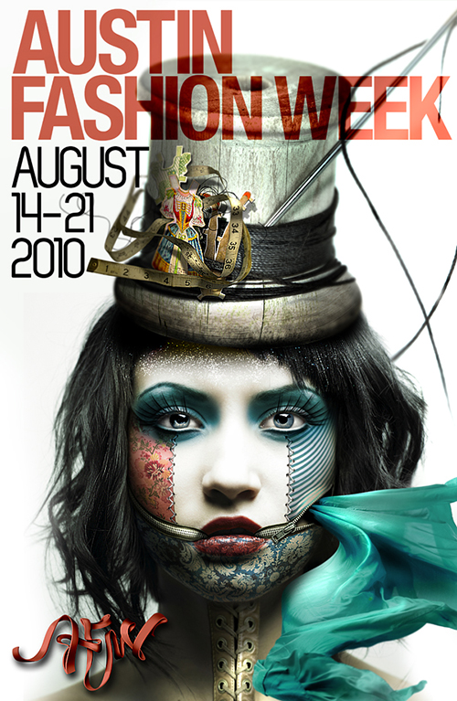
Original source: https://www.behance.net/gallery/Austin-Fashion-Week-2010/450865
Gary Dorsey is an absolute master of photo manipulation and graphic design. He created this poster print for the 2010 Austin Fashion Week. When looking at it, it mirrors many of the modern aesthetics that we’ve come to expect from a young and cool fashion show: edginess, mystery, darkness, vibrance, and conceptual thinking. I would want to visit this show just because the print design promises something fascinating and fierce.
On a practical design level, the piece uses lots of negative (white) space to give it a clean and fresh look and uses “pops” of super-rich color accents to give it punch. The great typography and simple composition also go a long way in making this poster a success. There is also something to be said for the skill of the digital artist in creating this beautiful image that echoes the skill and ability of the designers that showed their collections in Austin.
Most of all, I think the fragile, Coppélian, doll-like image is such a great visual concept that perfectly demonstrates a super-cool, steam punk aesthetic.
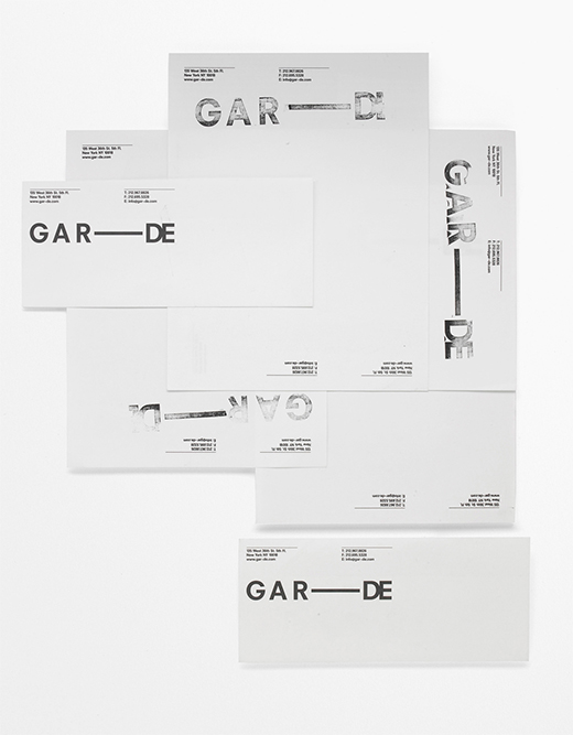
Original source: http://www.septemberindustry.co.uk/graphic-design-for-fashion/
Jiminie Ha is graphic trailblazer who is on the cutting edge of typography and design, and therefore was the ideal choice to design these letterheads and business cards for the graphic design and fashion consortium GAR—DE. The letterheads feature a hand-stamped logo with varying degrees of legibility that answer the unconventional aesthetic of GAR—DE.
This hand-stamped design style ties in brilliantly with the punk rock/alternative notion of handcrafted and self-produced prints. It also speaks directly to the counterculture audience who respond to noncorporate and individualistic ideals.
Looking at this brand design from purely a design level, there is a simple elegance to it that shows a genuine and superior knowledge of art, style, and composition. From the Avant Garde font choice to the stamped ink effects, the design reaffirms a very unconventional aesthetic and brand that most fashion businesses can only hope to achieve.
It is also important to point out that without any photographic imagery to tell us what industry these cards represent, we immediately know that this is a company on the edge of style and design.
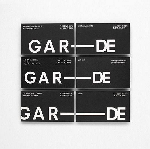
Original source: http://www.helenjennifermarchant.com/Awards-Experience
UK designer Jennifer Merchant has created these sublimely original and impressive print pieces for a fashion promotion. It is a flyer that is full of mystery and surprise, and demands to be viewed. Like a graphical present, it forces the recipient to unwrap the print to find out what’s inside!
Interactivity is not the only key to this design’s success. The gorgeous font (designed specifically by Jennifer for this project) with uniformed placement of characters creates a pattern within itself and is fascinating to look at. The typography seems less like symbols and more like a puzzle that the viewer just has to figure out.
The high-conceptual quality and attention to detail in this print sets this apart. Every element, from the font to the fashion photography, has been carefully considered and perfectly executed. The way this flyer folds is incredibly complicated, yet the design itself has a super-clean fashion aesthetic that looks deceptively simple and supremely elegant.
Original source: http://www.behance.net/gallery/Fashion-Museum-Identity/12929933
It’s amazing how the simplest shape or icon can sum up a whole fashion identity and can be the springboard for so much creativity and concept. Finding that one spark of a certain line, pattern, avatar, etc., can be the genesis for a whole brand going forward. This is exactly what has happened with the branding work by Diana Gibadulina, a Russian designer who created a through-the-line fashion project for the Moscow Fashion Museum that included everything from flyers to 30-ft banners.
The whole event branding seems to stem from the “MM” initials shape that she abstracted into a simple twin-line form – a shape that is constantly repeated throughout all the print products she’s designed and thus creates a sense of neatness and uniformity. When a designer is able to carry a particular shape or statement throughout a campaign, the result is always visually reassuring and pleasing to the viewer. Plus, thinking ahead, it helps to create a recognizable visual signal whenever any print, web, email, or other promotion is created in the future.
The simplicity of the black and white contrasting colors that we see throughout this print campaign is super clean and elegant; simple repetitive patterns and beautifully presented products are a bold statement of classic couture. Everything from the font choices to the contrasting compositions has been carefully considered and executed.
Original source: http://www.behance.net/gallery/Azede-Jean-Pierre-SS-2011-Lookbook/11046171
This fashion portfolio book was created to promote Azede Jean-Pierre. The Brooklyn designer Joseph Veazey who created this series of design catalogs refers to them as “lookbooks” and they are a lesson to us all in how to present a collection in print. There is an incredible amount of planning and effort that has gone into these hand-assembled portfolio pieces that are mailed to various stores, magazines, blogs, and other media targets. Inside the box is an inventive mixture of portfolio prints, a price-point guide , a CD, and even a neat little print holder that enables the viewer to look at each outfit individually.
The whole piece is so inventive and shows what can be done when you put that extra thought and effort into the promotions you produce. The quality of the portfolio framework he created to display the collection is a real triumph of skill and imagination. The entire piece is amazingly interactive and bags-of-fun for the recipient, who is encouraged to rip and tear perforated items to create their very own “viewing stage” to look at the collection.
On a design level, the simple manila items and uncomplicated design elements draw focus to the collection itself. But it’s the attention to detail, like the wax-paper pricing guide and the pop of red among the earth-tone colors, that really makes this design special.
Imagine being an investor or boutique store receiving this portfolio book. Your first impression would be that this designer really cares about their collection and about how it looks. You would also assume that this was a style-conscious, creative, and talented person that you should be talking to! The strength of his collection is made even stronger by the original way it is presented.
Looking at these fashion print examples, I think the biggest takeaway for a fashion designer creating their own print products is to be original and to try to repeat the same sense of style from your fashion collections in your promotions. Organize or design your print promotions in the same way that you approach your fashion pieces and view everything from the catwalk to the event poster as part of your collection. Try not to think of your promotions as separate and singular items, but rather present your collection as one experience.
For fashion flyers, booklets, retractable banners, event banners, and other promotional prints, go to our main website to see our competitively priced print products and custom print options.

 Original source: http://www.septemberindustry.co.uk/graphic-design-for-fashion/
 Original source: http://www.helenjennifermarchant.com/Awards-Experience
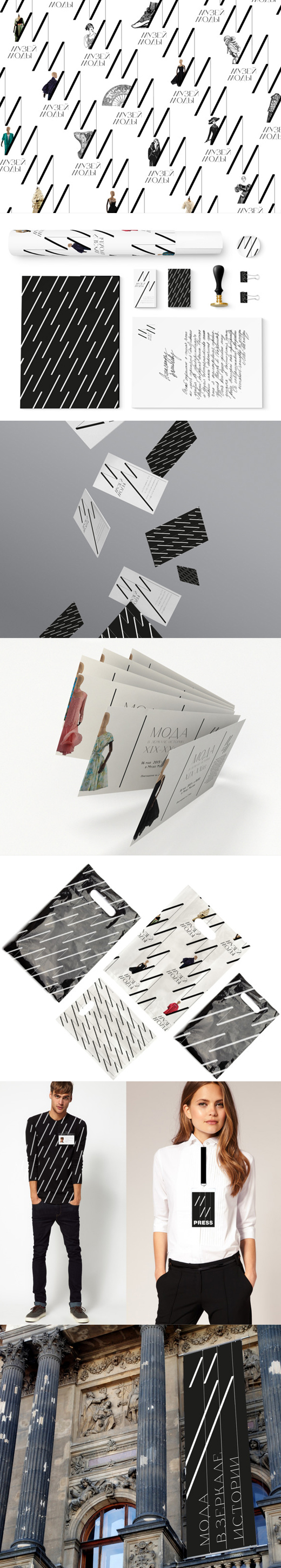 Original source: http://www.behance.net/gallery/Fashion-Museum-Identity/12929933